**Ring** Hobbit House Roofers. Peregrine Took Speaking

American house architecture was much more exuberant in the 1920s than since. I’ve worked on houses from the 17th century through the 21st, and the 1920s can lay a claim to being the most useful and practical without giving up anything in the style department. They’re generally smaller than a contemporary house, but that’s a feature, not a bug, if you ask me. Most contemporary houses are huge because they waste a lot of space, and waste it in multiples while the occupants try to find a corner of their caverns to actually live in. If the houses were designed better, they could be smaller. They aren’t, so they can’t.

They were, in the twenties. It’s important to remember that compared to the walk-up rented apartments and ramshackle shacks the twenties homebuyer was moving from, they weren’t all that small. But a 2012 female person takes one look at the modest closet, and the 2012 male person vainly searches for seven feet of blank wall for their TV, and are disconsolate.

One of the most exuberant style items afoot back then architecturally was the faux thatched roof. That’s what you’re looking at there. The Arts and Crafts retreat to rusticity was in full play. But hobbit house roofers are hard to find in the 21st century, and so the homeowners had to find someone willing and a little unusual to plan the necessary assault on their roof and their checkbook.

The roof is a very large visual element on a house. 90 percent of them are blah expanses of asphalt tab shingles. Back a hundred years ago, you might find asphalt shingles, of course –the house in the picture might have had them as original equipment — but you’d be just as likely find slate, or sawn cedar, or heavier split shakes, or metal. They’d be laid in interesting patterns and a wider palette of colors than now, too. “What color gray do you want” is all they ask you at the lumberyard now.

I’ve repaired curved roofs like this. I cheated. If you lay cedar shingles on the lawn in the early morning, the sunny side shrinks and the damp, grass side expands, and they “cup” a good deal. You can bend them the rest of the way by hand and nail them down if you’re in a hurry. The steam box in the video is a much better method, of course. Well, “better” until you get the bill, anyway.

You can see some more faux-thatched roof designs, among other wonders, inside Classic Houses of the Twenties (Dover Architecture)

Kitchen Stories

Three Years Ago I Invented Blogging And Wrote This
 

[Author’s Note: Four seven years ago all I had was dial-up Internet access, but started an Internet cottage furniture business anyway. Like with everything else, I was a cranky autodidact, and painfully taught myself HTML by fooling around with FrontPage, toggling back and forth in the WYSIWYG window to compare the code to the appearance of the page. I had no idea there was anything like a community of blogs, and just started writing essays on my What’s New page. Here’s one from 2005 I’m not ashamed of.]

[Author’s Note: There is no editor}

Now, I’m going to forgo maundering on about the good old days, because this is thirty years before I was in the game, so to speak, and I don’t have a dog in that fight.

But look at that room. It’s glorious. You’d kill for a kitchen that pleasant to be in, and we’d get you to sign the closing papers before you noticed there isn’t a dishwasher, unless you count the girls in the chairs. Please keep in mind, this is not the rich folk’s house, or it wouldn’t be here. They were just regular people, like you and me, or maybe just me; you might be an Admiral or Rock Star or somesuch; I don’t know.

Let’s go over what they knew about a kitchen then, that they don’t know now.

First of all, look at the light. I’m referring to the light emanating from the yellow orb in the sky, which rarely gets into houses these days. The big girl on the right is reading, and that looks like a great place to do it. Two things bring in that light. First, the ceiling is high enough, but not vaulted. Designers vault rooms willy-nilly now, and make gloomy, echoey, medieval caverns out of rooms that should be close and homey. Kitchens get it a lot these days. You generally need four or five hundred thousand million watts of lighting in a vaulted ceiling kitchen to approach what they’ve got here, streaming right in. ( I might be a little off with my calculations on footcandles there, but I stand by the gist of it.)

That ceiling looks nine feet high. You can get a fairly airy ceiling by simply specifying full eight foot studs for the first floor wall framing of your house, and gain 4 inches for a few bucks. You’ll save people like me from getting cracked in the head by your inexplicable ceiling fans on a 7′-8″ ceiling that way.

The ceiling would undoubtedly have been white calcimined plaster, to reflect the light. Calcimine was a form of paste used in lieu of paint on ceilings, that you had to wash off before recoating. Everyone forgot that eventually, and painted over it, and it peeled forever. Your recollection of endlessly peeling Victorian and WWI vintage house ceilings generally traces back to calcimine. In the fifties, peopled stapled asbestos and cardboard tiles over the flaking paint, in the sixties they tried acoustic drop ceilings, the seventies tried swirled sand textured paint over the mess, and the eighties tried the judicious use of the wrecking ball.

But everyone’s forgotten to make the ceiling high enough to make the room proportionate to its length and width, allow the windows to be tall and stately, and let in extra air and light. Your present kitchen is almost undoubtedly larger than this, and I ask you, could you fit those four children into yours while you worked at the sink? (Count the shoes, there’s four, trust me) The designer knew enough to put windows on two walls in the room, and not just one. It’s possible to get natural light into a room with the windows ganged on one wall, but its hard to do, and unlikely you’ll manage it. Lighting your face from one side alone makes for interesting Beatles album covers, but it’s no way to live.

Look at the pantry cabinet on the facing wall. it’s in a niche, to allow you to get around the room, with a nice flat counter to display what is obviously a prized possession, with room to spare for day to day use as a work surface. Lovely. Even expensive kitchen cabinets are really crummy these days. They’re more often than not made from particle board covered with plastic woodgrain paper with a design imprint that looks like someone who liked Lawrence Welk a lot drew it originally. The only real wood on cabinets now is the doors, and they always are overlaid on the face, not inset like the picture. They are overlaid to save the manufacturer trouble, not give you a better looking thing; these cabinets have the doors inset into the frame, which is fussy, and looks terrific, and is not like most modern cabinets. The modern version looks more like the box a cabinet comes in than a cabinet itself.

The cabinets here are painted, probably glossy white, looked spiffy, reflected the glorious light some more, cleaned easily, and could be refurbished when they got to worn by a conscientious homeowner. Nowadays, since you’ve ponied up all that money for your cabinets, they’re probably solid hardwood faces, with uninteresting grain, dark enough to soak too much of the light up, and make you add still more lightbulbs to try to see in there. They’re sprayed with a thin couple of coats of nitrocellulose lacquer, which is tough as nails, at least until it isn’t, which is fairly soon, and can’t be rejuvenated by hand, and end up in the trash every ten years, no matter what you paid for them.

That fridge is really small, but the homeowners probably had spent their childhood with an icebox, or some without even that, and thought it was a marvel, no doubt. And it has the supple streamlined corners and clean white metal baked enamel glaze that says “clean” to me. You wouldn’t feel the need to put wood panels on the front of your refrigerator if it looked that, well, cool.

The simple checked floor is terrific. Really underrated, that kind of simple decoration. The photographer is probably standing in the door that leads to a dining room, or a hallway or parlor if the house is small. The homeowner has hung a pretty little mirror on the wall, canted just so, so she can see behind her when she’s at the sink, or alternately look out the window. People still make the mistake of making the sink a sad, lonely place to be, and occasionally make it even worse than bad, by running the cabinets right across with no window, and doom the user to hours of staring at nothing, their back to everyone, whether you have a dishwasher or not. For shame!

You all know me by now, and know full well that I’m going to steal the design for that gate leg table in the middle of the room. Oh yes. It’s the perfect work island for food prep, and presto, open it up and you’re eating the finest meal in the world, which is placed on the table direct from the oven or stove, by Mother’s hand, surrounded by your loved ones, the clink of glass and china and cutlery a domestic symphony, the beaming faces of the children arrayed around the round table, with the late afternoon sun beaming in and the family beaming out.

Get some of that lost kitchen, as much as you can find, fit, or afford, and I’ll bless it for you, right here and now.

Build A House In Six Minutes Flat

For some reason, I’m reminded of W.C. Fields’ assessment of Mae West: A plumber’s idea of Cleopatra.

Oh, well; at least the trick-or-treaters will know where to ring the bell.

Elderly Pixels Being Viewed By Agoraphobic Misanthropes For Some Reason, Example 23


(From 2008: Please  note that only four years later blue and brown is in complete remission)

Ten Dreadful Things That Have Become Housing Standards

I’ve been watching all the “Let’s have a housing makeover” shows. It’s interesting how many of them there are. Everyone seems to be interested in the design process now. There’s very little of what used to be the norm in home-improvement shows — pointing the camera at the people doing the hammer and nail work. Now it’s point a camera at the realtor, or the curtain guy, or the designer for the most part. They have elves do the work while the camera crew is at lunch, I guess.

Most people get their ideas about what to do in fashion by looking at what other people are wearing. Essentially, all the home rehab programs are fashion shows at this point; centered around the soft goods. I’m in the furniture business now, so it’s sort of my game, but I used to be more heavily into the building of the actual house, so there’s some things about the whole megillah that bug me.

They bug me because everyone is doing them because everyone is doing them. They are ugly; or nonsensical; or counterproductive; or wasteful; or mostly an ephemeral fad being written into concrete — always a bad idea. The decorative stuff is going to be painted over shortly or thrown in the dumpster too quickly, and the permanent installations are going to make the owners miserable for generations because they’re too expensive to get rid of.

So here’s my counsel. STOP DOING THIS:

1. Snout houses.
Stop nailing your house onto the ass end of your garage. I’m not going to explain myself. I shouldn’t have to. You are building a house for your car and living in a shack out back. Never ever ever do it.

2. Putting a flatscreen TV over your fireplace mantel.
Profoundly dumb. It’s tiring to look at screens above eye level when you are seated. Designers have given up doing their job integrating two things to look at in the same room, and so have stacked them. They’re not washer/dryers in a condo, people. You’re slouching in your chair and getting headaches and backaches trying to look at the thing. There’s a reason no one sits in the first row at the theater. Look down slightly at entertainers, and the entertainment, too.

3. Putting the microwave over the stove.
Reaching over a hot stove to remove dishes sometimes filled with superheated items, above eye level for most women and all children is profoundly dumb. It’s the greasiest place in the world, too. Put it in the island and your five year old can make their own popcorn.

4. Cooktops in islands with seating.
I love to have hot grease spatters launched at me while I’m seated across an island from the cook. The boiling cauldrons of water give a nice netherworldly effect as well.

5. Open plan in a big house.
Open plan is for little houses, so rooms can share some space with one another and counterfeit roominess. A big house with undifferentiated space is a airport lobby. Last time I checked, having doors doesn’t preclude a plan from being “open.” You just leave them open. Not having them does preclude you from closing off the rooms when you want to, though. Even small houses are better with rooms that can be closed,if you ask me.

6. Very high ceilings in a family room.
You’re trying to watch TV in there, or talk to one another, and the sound bangs around like an airport hangar. You’ve got an open plan so you get to listen to the dishwasher and refrigerator run, too. A two story bedroom is pretty dumb, too, but I don’t want to make a Top Eleven list.

7. Plastic everything.
Vinyl sided, rubber windows, plastic decking… Man, everybody’s living in a big rubber box nailed on the back of a garage. Wood, stone, masonry, glass, paint, people.

8. Ceiling fans everywhere.
Do you all really think you live in Casablanca? If I go into another ranch house with a ceiling fan hanging down from a 7 foot 6 inch ceiling, I’m going to go postal. If I can’t stand up in the middle of the room without getting a bruise or a haircut, you’re doing it wrong. There is no stratification of air in a house. Doesn’t happen. You’re screwing a window boxfan sideways to your ceiling. Stop it. Your house has AC anyway. And you live in Wisconsin. Cut it out.

9. Enormous jacuzzi tubs.
You can ooh and aah all you want when you go in the bathroom and see a big jetted tub with a window over it, and a skylight above, but I’ve got news for you: You will patronize your undertaker more often than you use that tub; 99% of humans will not bathe in front of a window; and the skylight will rain condensation every time you take a shower, forevermore. Strike three.

10. Blue and Brown.
I’ve lived through this three times now. I’ve ripped all this stuff out twice with customers muttering “What were they thinking?” Powder Blue and Cocoa Brown DO NOT go together under any circumstances, anywhere. Except of course in every room on every show on television.

Old Posts People Are Reading For Some Reason, Part The Third

The Greater Fool Theory Of Housing

I must open by assuring everyone that I’m not denigrating other people because I don’t like their houses. When I hear buzzwords like sprawl and McMansion and hyperconsumption and unsustainability and so forth, they are universally used as pretexts to allow the author to hate his fellow citizens without seeming snobby. No one needs what I don’t want is the slogan of the age. And all the schemes are about rationing now. Martinets will decide if you need something or not. I hate it.

I don’t want you to live in a snouthouse, though, but not because I don’t like you; it’s because I think you’re swell and I want you to be happy. Your house might be making you miserable, and you don’t know why. I know why.

I was asked in a formal setting why I make furniture. I have many stock answers for that, but I hesitated for a moment this last time, because it occurred to me that I was fighting a rearguard action against a determined foe, one that was beating me. The American house is being ruined, and I’m fighting a guerrilla war by trying to help people return a little soul to their homes by filling them with furniture that’s got some. Half-million dollar mistakes have no reset button. You’ve got to deal with them.

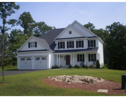
Here’s a house for sale close to where I grew up:

Everyone looks around and sees houses like this. They pass unremarked now. After a while, if it doesn’t look like this, people are going to think a house looks strange. And it’s wrong, wrong, wrong. The situations where a house nailed on the ass end of a garage are appropriate are so few there’s no use talking about them. Never do this.

There’s Postmodern evil afoot here. Everything is boiled down to a pastiche, and you put all these disconnected totems into a blender and put the mixed up parts on a concrete rectangle. It’s making us all crazy in a very subtle but profound way.

There has been a concerted effort to dismantle all standards of right and wrong and beauty and truth. If ever truthiness was put into sticks and bricks, this house is it. When you rebel against standard things, sooner or later you run out of ways to be original, and all that is left is to do the exact opposite of good. It’s the only permutation of new that’s left to you after a while. The American house is becoming that perfect distillation of bad ideas. Everything exactly at cross-purposes with its stated purpose.

People are rational and no rational person will ever feel any close connection with this structure. They will be proud of their house because it conforms to the general description of what a house should look like. There’s a reason why everyone wears skinny glasses in one decade and skinny ties in another, all doing it at the same time as if on command. People will look the same kind of weird if they think that looking weird makes them look normal.

“The Greater Fool Theory” means you purchase equities or commodities not based on any intrinsic value they hold, but simply based on the assumption that you can find a “greater fool” to purchase it from you later at a profit. When people refer to Wall Street as a big casino, they’re right only because they behave like a racetrack tout there; there’s no reason why it should be that way. People should invest to own a portion of a company whose activities generate more than publicity and venture capital and the hope of a greater fool.

I read that the minute people are under water on their mortgage, many mail the keys to the bank and leave, because they “invested” in their house in the same Greater Fool way. It’s just a big plastery box nailed on the back of a garage, after all. When escape from the house via automobile is the central theme of the structure, I figure the lienholders surprised by default should have gotten an Omega Man vibe from the occupants, not a Harry Bailey worldview, and planned accordingly.

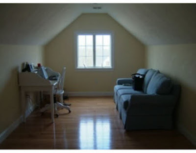
Here’s the “bonus room” you get for making your house into an outbuilding for your car:

I was going to make a joke and compare this room with the room Hitler was confined to in Landsberg Prison, where he wrote Mein Kampf, but I realized halfway through that I’ve seen pictures of Hitler’s room in prison and it’s a lot more pleasant than this one.

Stop building this house.

Tag: architecture

Find Stuff:

Archives